


New Eastern logo gets indifferent review from athletes
October 13, 2015
The Eastern athletics department unveiled a new Panther logo a week ago after the Vice President for University Advancement Bob Martin announced the event in the Buzzard Hall Auditorium.
This logo replaces the most recent Eastern Panthers logo, which has been used since 2000.
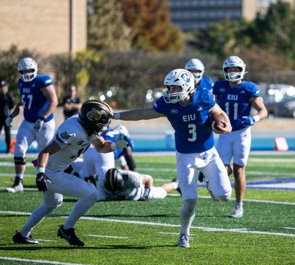
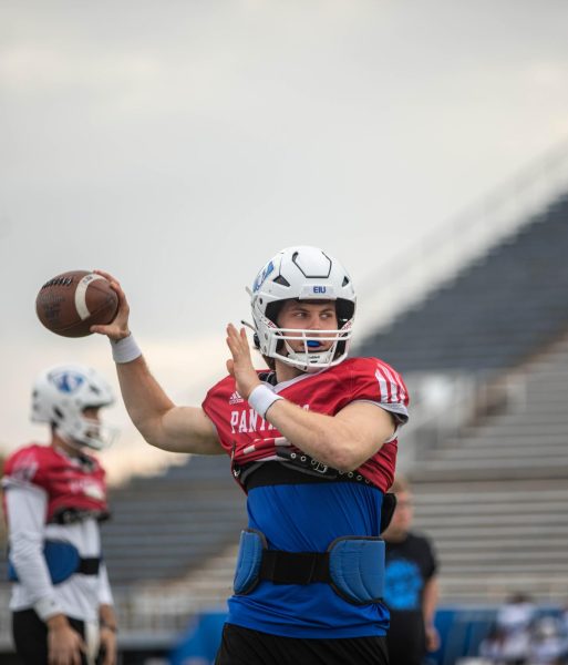
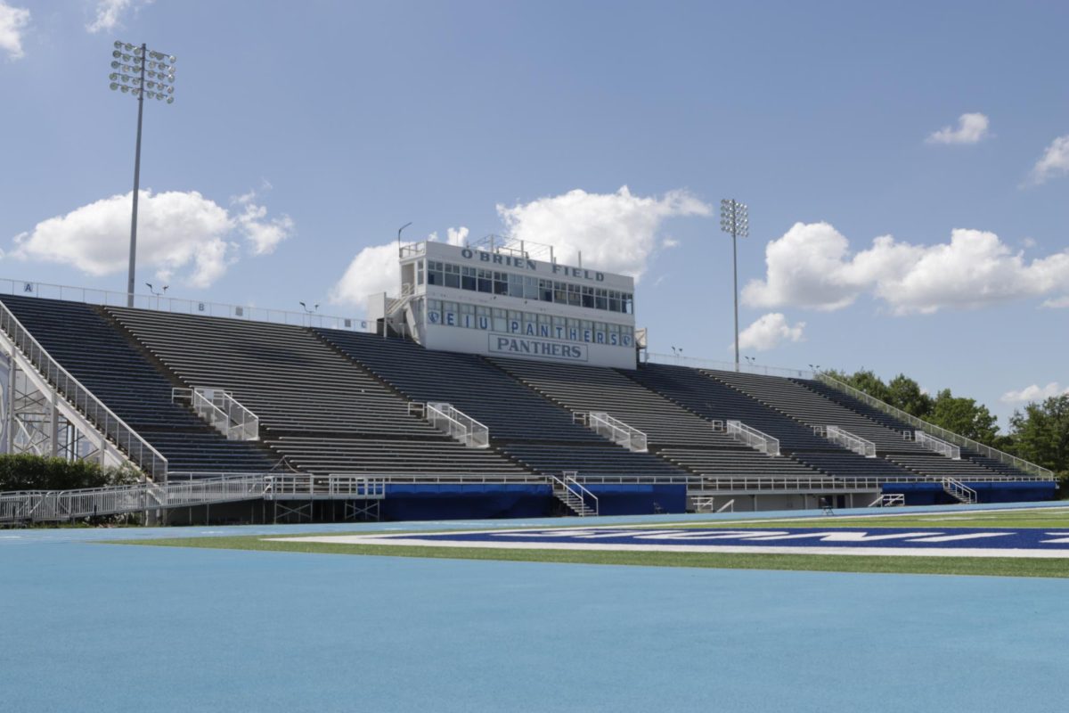
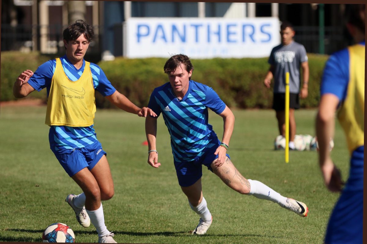
The new logo made its first appearance for competition Saturday as the Eastern football team sported the logo on its helmets in the game against Southeast Missouri State at O’Brien Field.
Several athletes have expressed their opinion for the new logo as it will eventually be implemented in every sport.
Sophomore cross country runner Maria Baldwin said the new logo is fine.
“I like the way it incorporates our school colors,” she said. “I know some people have mixed feelings about it, but it’s the new logo on the jersey that I’m representing, and I take pride in that.”
Since last spring, a committee of people including members of the Eastern administration, athletics, employees of the Eastern bookstore and Eastern Board of Trustees student representative Catie Witt have been working with the Collegiate Licensing Company on this logo.
The committee looked at a number of different looks and color schemes that work.
Senior tennis player Robert Skolik thought the new logo turned out great, but wishes the unveiling came out earlier.
“I do wish they could have unveiled it prior to the semester starting,” he said. “I think it will be interesting watching the athletics at EIU shifting to a new theme throughout the year.”
Martin explained during the unveiling last week that the process to change out the older version of the logo that are already incorporated on the campus will not just change overnight.
The new logo that is currently in the middle of the football field will stay as long as it can until it wears out, or until the university gets enough money to replace it.
Eastern senior volleyball player Stephanie Wallace was skeptical about the new logo.
“It is really different from the old logo,” she said. “I personally don’t think it looks a lot like a Panther. I will get used to it though. It’s just really different.”
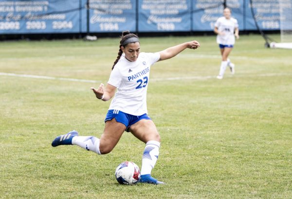
Eastern senior soccer player Molly Hawkins was also indifferent about the logo.
“It is more modern looking and unlike other school’s logos,” she said. “It does give a new and refreshing look to Eastern, but after having the old logo for nearly 3.5 years of my college career, it’s going to take a little bit of getting used to.”
This logo is the seventh in Eastern’s history.
Bob Reynolds can be reached at 581-2812 or [email protected]